
The story behind the logo
Refraction
Dip an oar into the water. Everyone watching from the surface sees it bend. The oar is not broken; the light is. As light passes from water into air it changes direction, and our eyes show us a slightly shifted version of what is really there.
Divers live this on every dive. Seen through a mask, objects appear about a third larger and a quarter closer than they are. Distance deceives, size deceives, and colours fade one by one with depth. Everything you see underwater is a story your brain is telling you.
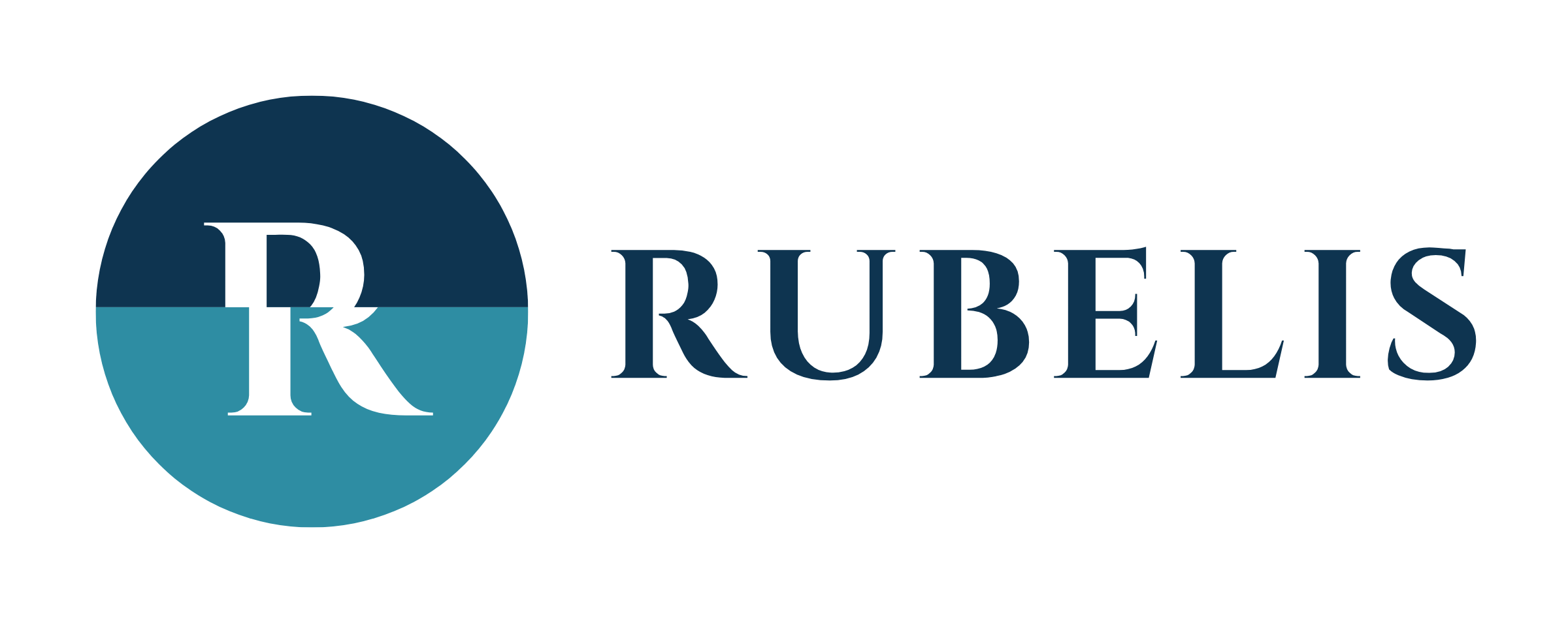
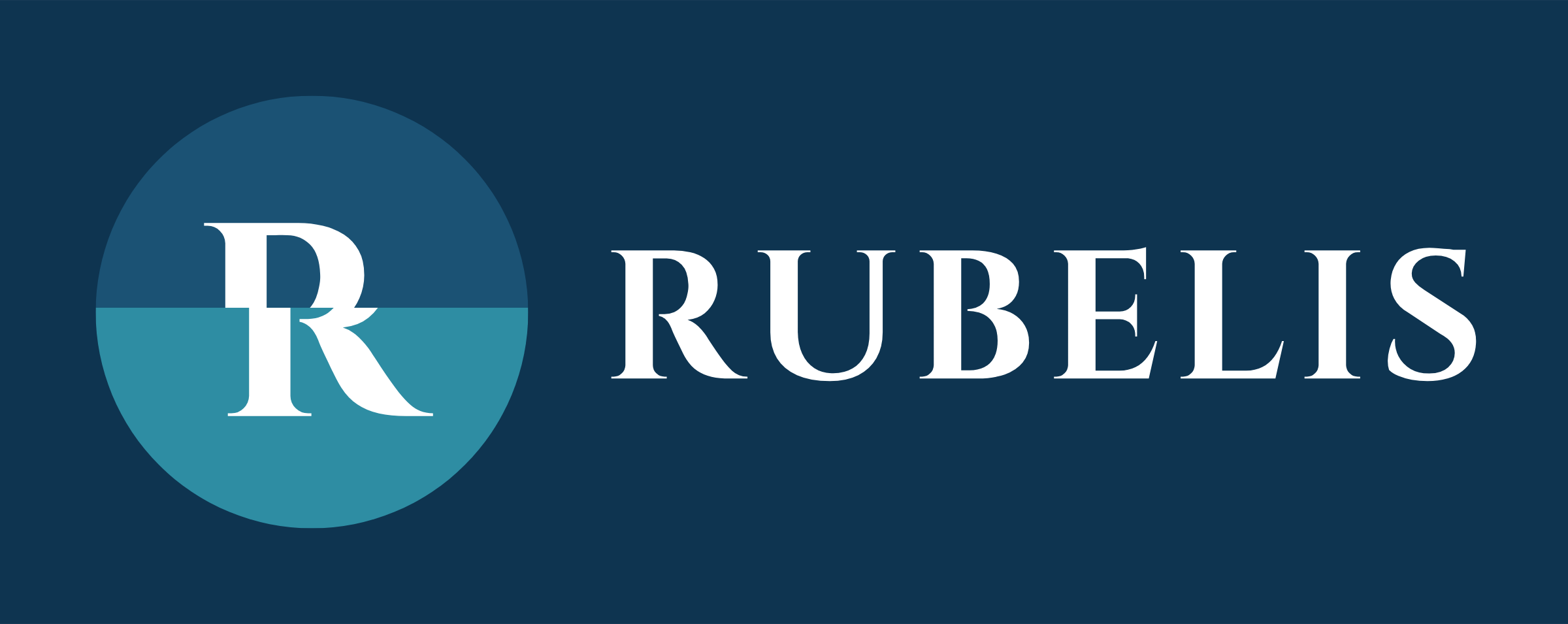
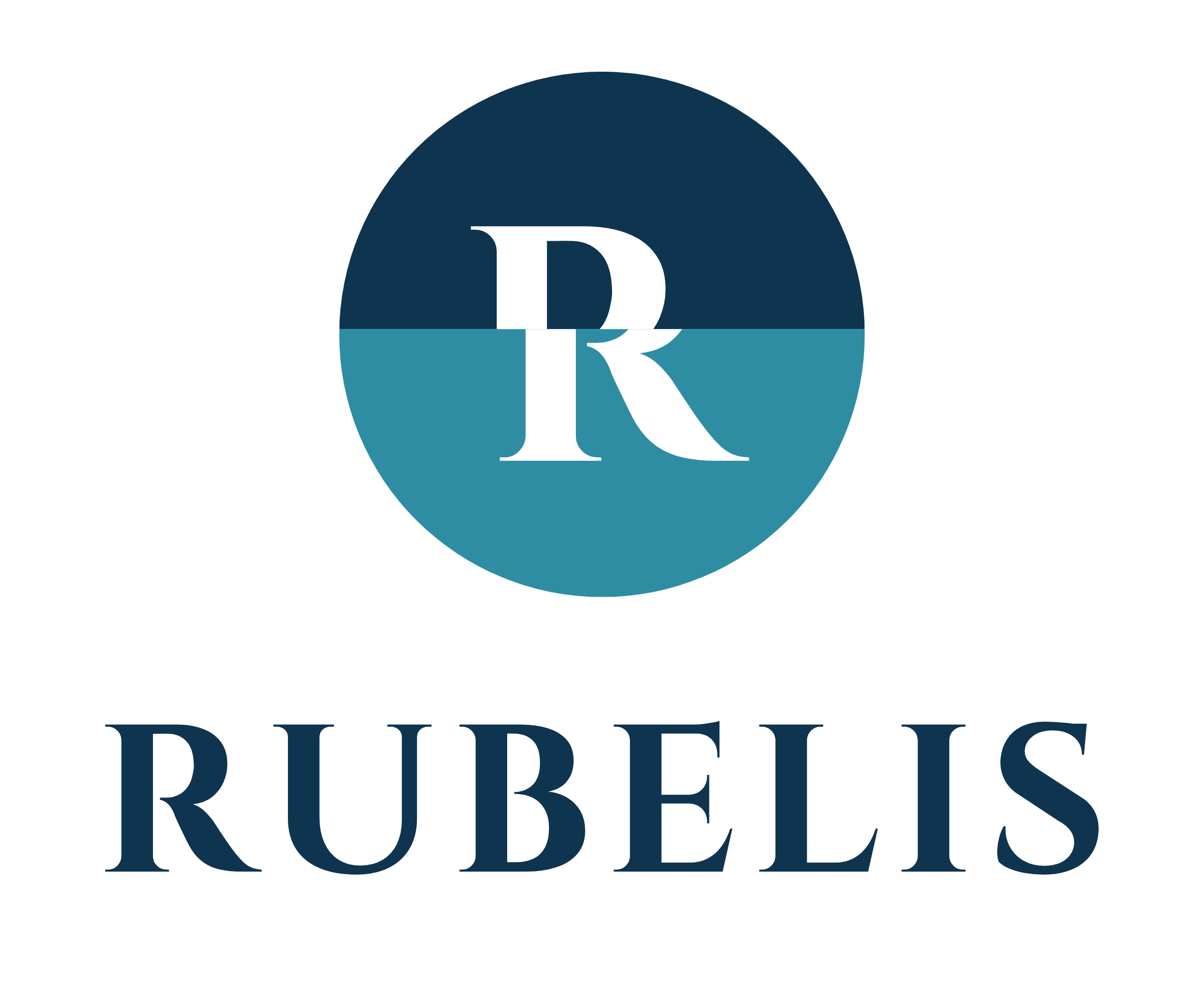
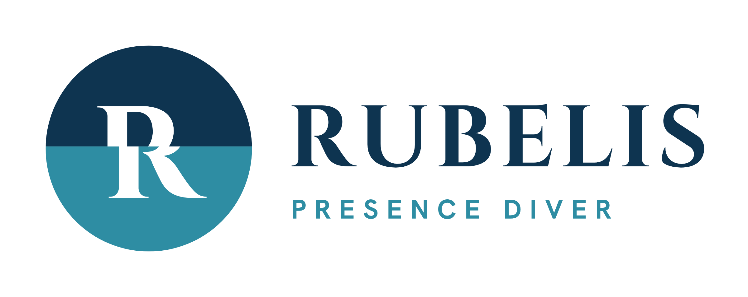
The R of Rubelis breaks exactly on that line. The upper half is the surface: the world we look at out of habit, in a hurry, from memory. The lower half is beneath it: the same letter, repositioned for a different reality. The letter never loses its integrity; it simply asks us to notice where it stands.
This is what Presence teaches: to notice the shift. A good diver can tell the story they see from what is really there. Panic often begins at the moment those two images blur; calm, at the moment you can see the difference between them.
Every time you use this logo, you say the same sentence: to see beneath the surface is to learn to look again.
- The waterline
- The horizontal line through the circle is the surface: the boundary between two worlds and the place where attention begins.
- The shift
- The lower half of the R shifts as far as the light bends. It is not a mistake; it is the logo itself, and it is never corrected.
- Navy and teal
- Navy is the world above and the depth itself; teal is the water column, where the eye has to do its real work.
- Orange
- The colour of a diver's surface marker buoy. Reserved for the most exclusive title, the Founding Instructor seal.